There has never been a greater need for visually appealing and user-friendly websites in the rapidly evolving field of web design. A responsive website is now vital due to the increase in the use of mobile devices. There are many themes available for WordPress, but it can be difficult to identify the best responsive themes. We examine the top responsive website templates, mobile-friendly website templates, and WordPress responsive themes in this post, which dives into the field of web design.
Table of Contents
The Importance of Responsive Design
It’s important to understand the importance of responsive design before we go into the top responsive WordPress themes. In an age where smartphones and tablets control the web, visitors visit websites from their screens. A responsive website modifies its structure and visual components to offer the best possible experience for viewing on all types of screens. Because mobile-friendly websites are given higher priority by search engines like Google, this improves user delight while also helping websites rank better in search results.
The Best Responsive WordPress Themes
For their responsiveness and flexibility, some top WordPress responsive themes are listed:
Avada
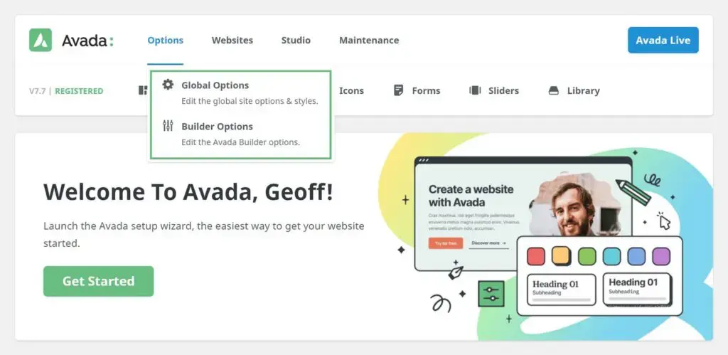
Among the most popular and flexible responsive website templates available is Avada. Known for its flexibility and wide range of customization choices, Avada removes the need for coding skills and lets people construct beautiful websites. Because of its responsive design, users will always have an excellent time using your site on various screens.
Learn How to Install and Setup the Avada Theme.
Divi
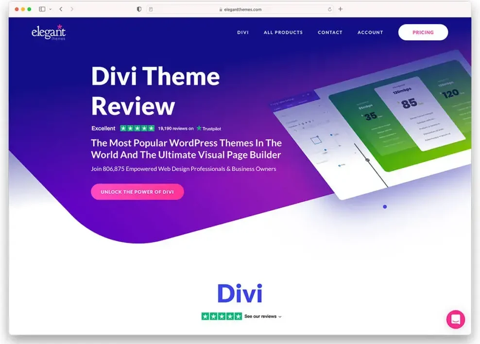
Elegant Themes’ Divi theme is a powerful and user-friendly theme with an included drag-and-drop builder. Users can now easily design unique layouts for their websites thanks to this. Divi’s responsive design ensures your website looks good on desktops, tablets, and smartphones. Divi is a popular WordPress theme among many users because of its wide range of pre-designed layouts.
Learn How to Install and Setup Divi Theme.
GeneratePress
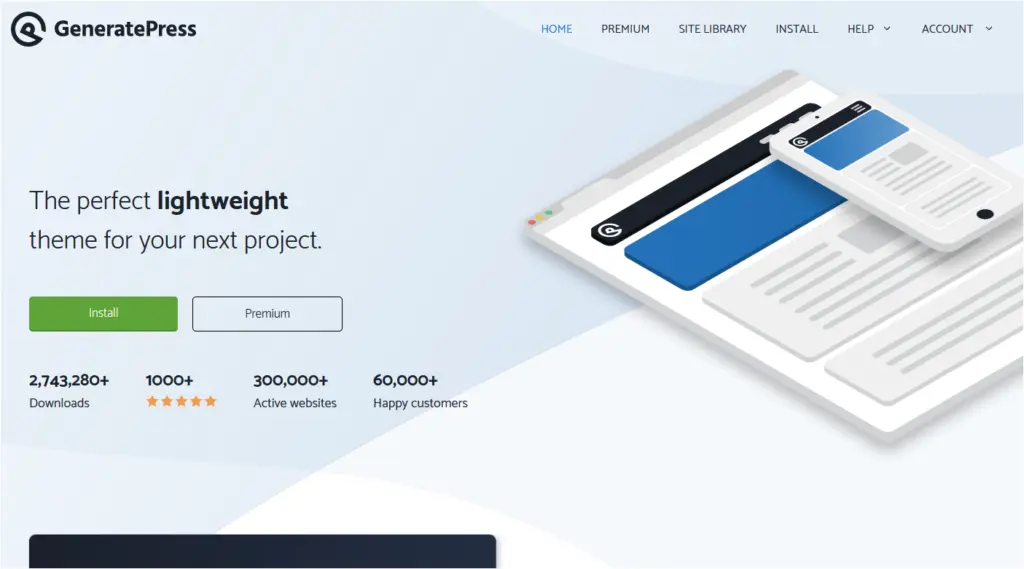
The fast and responsive theme GeneratePress is known for its efficiency. It is compatible with many plugins and is developer-friendly. It offers a free version with basic features and a premium version that extends its capabilities. The theme is known for its minimal footprint, with a page size of just 7.5 KB, contributing to faster load times and improved website performance.
Astra
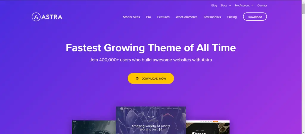
Astra is a light and quick WordPress theme with a focus on flexibility and performance. Because of its full responsiveness, your website will appear faultless on all devices. Astra offers a variety of starter templates to get your website design project off to a good start and is suitable with well-known page builders like Elementor. Its SEO friendliness offers even more appeal for people trying to increase their internet profile.
Learn How to Install and Setup Astra Theme.
OceanWP
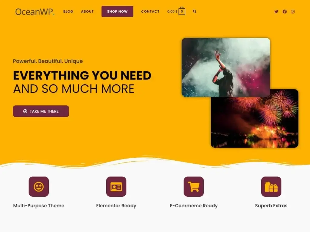
OceanWP is a flexible WordPress theme that is optimized for mobile devices, and it works well for a wide range of website types. With OceanWP, you can create e-commerce sites, portfolios, blogs, and other sites with adaptable design features that adjust to different screen sizes. This theme, which emphasizes speed and SEO optimization, is a great option for anyone seeking a full package for their WordPress website.
Learn How to Install and Setup OceanWP Theme.
BeTheme
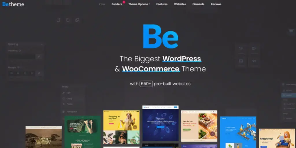
BeTheme is a powerful WordPress theme that comes with an amazing collection of more than 600 pre-made websites. Due to the full responsiveness of each website, users will receive a pleasant and reliable experience on all devices. BeTheme is known for its flexibility and range, which make it suitable for a range of areas and uses.
Learn How to Install and Setup Betheme.
The7
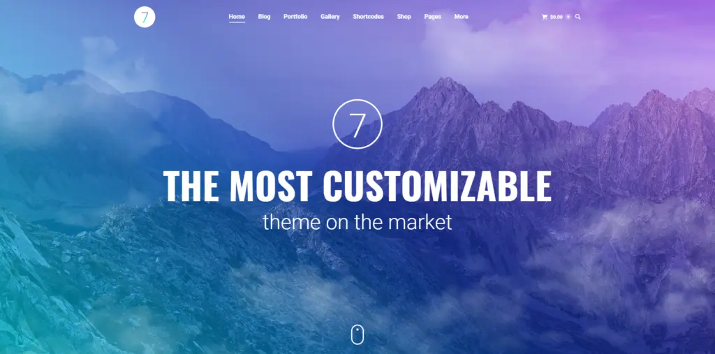
The7 is a responsive WordPress theme that successfully combines style with function. How it works with Ultimate Addons and the WPBakery page builder allows customers to easily design beautiful layouts. The theme ensures that your website will look great on displays with high resolutions because it is responsive and retina-ready.
Zephyr
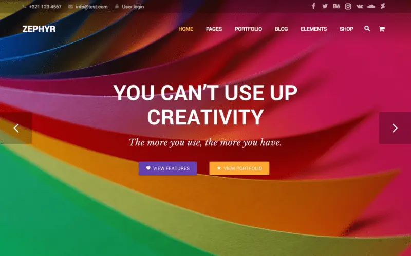
Zephyr is a responsive website template created for portfolios and businesses. Your content will appear great on screens of all sizes, thanks to its responsive design. Zephyr gives you an array of customization decisions and several homepage layouts to help you build a unique and attractive website for your business.
Verify that a template is responsive on several devices and browsers before selecting it. Take your website’s unique needs and style choices seriously. To make sure that the licensing terms meet the demands of your project, always double-check them.
Conclusion
Having a responsive website is a must in the constantly changing world of web design; it’s not just an era. From adaptable themes like Avada, also known as Divi, to lighter options like Astra and OceanWP, the best responsive WordPress themes covered in this article provide a range of solutions for various likes and uses. Selecting a mobile-friendly theme is an essential first step toward building a successful website, no matter whether you’re a developer, blogger, or business owner. These themes represent the height of web design, as advances in technology offer a foundation for visually appealing and responsive websites on many devices.
FAQs
How do I know if my WordPress theme is responsive?
You can use online tools like Google’s Mobile-Friendly Assessment or resize your browser window to assess how responsive your theme is. Additionally, most modern WordPress themes explicitly mention their responsive design in the theme description.
Can I make my existing WordPress theme responsive?
Selecting a theme that is responsive by nature can be more sensible than trying to make an existing theme responsive through custom CSS and tweaks. It is simpler to incorporate responsive design while creating a theme.
Do responsive themes impact SEO?
Yes, SEO benefits from responsive design. A responsive theme increases the user experience on mobile devices and may help your site rank higher in search results because Google uses mobile-friendliness as a ranking factor.


